

Updated January 16, 2017
When you’re taking care of people who are sick or hurt, there are generally accepted guidelines and tenets which, if followed, produce good results for patients:
- Proper treatment starts with an accurate diagnosis, which is usually based on a good history.
- You’ve got to monitor vital signs regularly while the patient is under your care, make sure that your treatment matches the diagnosis, reassess and adjust your treatment based on response to what you do, and do no harm.
If you’re leading a system that cares for folks who are sick or injured, similar guidelines apply:
- Make sure you understand the problem before you try to fix it.
- Monitor the “vital signs” of your system’s key processes.
- Make improvements that are effective (produce the desired results), sustainable and cost-effective, and that don’t make things worse.
Measure what’s essential
As you build a dashboard of vital measures for your system, keep in mind that 10 or 12 that cover all of your system’s key processes is better than a thick report. As Robert Lloyd from the Institute for Healthcare Improvement says, “There are many things in life that are interesting to know. It is far more important, however, to work on those things that are essential to quality than to spend time working on what is merely interesting.”
One way to think about what’s essential is to make a list of the vital functions in your system which, if they failed, would have a major negative impact. Here are a few to consider:
- Clinical care (this will likely need more than one measure)
- Safety
- Fleet management
- Call taking and dispatch
- Customer satisfaction
- Recruitment and retention of employees
- Response time performance
- Materials management
- Billing
Define what the measurement means
It’s also important to have an operational definition for your measures. In other words, everyone needs to know what the label means in practice. For example, if you are measuring “response time,” the operational definition must include when the clock starts and stops—at the time of the first ring in the primary PSAP to when the wheels of the transport rig stop moving at the scene based on AVL data. Or if you’re measuring the effectiveness of your management of patients where time has a direct impact on outcomes such as STEMI, the operational definition for the measurement might be, “Time from onset of symptoms to reperfusion of the occluded coronary artery.”
I’ve heard a lot of EMS folks say, “We don’t control what happens before we get there or what happens at the hospital, so we should only be accountable for what we control.” If your measurement system is designed to judge how good you are, then measuring only what you control makes sense. However, if your measurement system is designed to be patient-centered, focused on improving results for patients, then measurements should be designed from the patient’s perspective. Remember that just because something can be monitored does not mean that it should be. I can’t count the number of EMS systems that can provide a report on their IV success rate, yet it is hard to find scientific evidence that IV success correlates with improved clinical outcomes.
Once you have an unambiguous definition of what you’re measuring, you need access to the data and the sampling strategy to collect it. It’s much easier to start with available data than to impose on your people new ways to document things.
Present your information in a usable way
Some EMS measurements are expressed as a percentage, such as the percentage of cardiac arrest patients who receive bystander CPR. For these it is helpful to carefully define both the numerator and denominator of the measure. The denominator could be all cardiac arrests where CPR was performed at any time (excluding obvious death), from any cause, run in the system each month. The numerator would be the subset of these patients who had CPR being performed on them when the first responding EMS crew arrived.
Other things are best measured by count, such as the number of critical vehicle failures per month. This could be defined as anytime an EMS vehicle suffered a mechanical failure while responding to, at the scene of, or while transporting a patient.
I recently spoke with a colleague who was looking at a pie chart of her system’s performance and said, “My boss is going to go ballistic when he sees this.” What you want to do is display the performance data in a way that accurately tells the story, guides the viewer to react appropriately and captures a dynamic view of the process. Bar charts, pie charts and those dang color-coded gauges/traffic lights are all static ways to display data and should be banned from all quality-related activity.
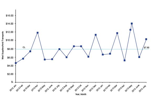
Dynamic performance data should always be displayed in its naturally occurring time order on a run chart or on a Shewhart control chart. Take a look at this run chart, which shows the average cost of medical supplies per call:
If you apply the right mathematical formula to a run chart, it will add upper and lower control limits creating a Shewhart control chart. Several software programs will do this for you; my favorite is QI Macros, an Excel template that provides lots of powerful analysis tools for a reasonable price.
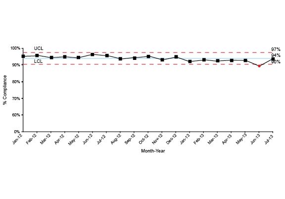
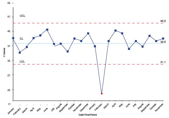
The chart below is an example of a Shewhart control chart that monitors response time performance.
Most people will look at charts like these and instantly start describing what they see and sharing their theories about why some dot is different from another dot. It’s important to train the folks who will read these charts how to analyze them.
There are several good books that can provide you with in-depth information about this kind of analysis, but my favorites are “Data Sanity” by Davis Balestracci; “The Improvement Guide” by Gerald J. Langley, Ronald Moen, Kevin M. Nolan, et al.; and “Understanding Variation” by Donald Wheeler.
Here are the essential things to keep in mind when looking at these charts:
1. As Davis Balestracci said: “Given two different numbers, one will be larger.”
This might seem like an idiotically simple observation, yet I’ve sat in thousands of meetings where some important person focused on why one number was different from another. From a statistical perspective, having one number larger than the other usually does not mean anything.
2. The key distinction is differentiating common cause from special cause variation.
All processes have variation, including the amount of time it takes a dispatcher to launch an ambulance after the 911 line rings and the number of employees who are injured on the job each month. Common cause variation is those differences that are just a normal part of the process; special cause variation is generated by something outside the normal process. For example, I used to live about 25 minutes from work. Sometimes it would take me 26 minutes, other days 23. These differences in travel time were just an inherent part of the process, thus common cause variation.
Or consider this example: One day as I was riding to work on my motorcycle, I watched a sedan t-bone a pickup truck in the driver’s door. The driver was one of the EMTs who worked on our team. I assisted with his treatment and jumped in the helicopter to help during transport to the trauma center. A field supervisor gave me a ride back to my bike and I rode the rest of the way to work. That morning it took me 2.5 hours because something outside the normal process caused things to be different, hence special cause variation.
3. The main reason to make a distinction between common and special cause variation is to guide you to ask the proper questions of the data.
For common cause variation you can ask, “Is this good enough?” For special cause variation you can ask, “What happened here?” W. Edwards Deming said that asking “What happened here?” with common cause variation was equivalent to “tampering,” which leads to bad management decisions. These bad decisions often make performance worse.
4. The vast majority of analysis can be accomplished with three simple tests for special cause variation.
Look to see if the data has any trends, which is six or more dots continuously ascending or descending.
Look to see if there are any runs — that is, eight or more continuous dots above or below the median.
On a Shewhart control chart, if you have a dot above the upper control limit or below the lower control limit, it is special cause variation.
The answers to the analysis questions, “Is this good enough?” or, “What happened here?” will help your leadership team make much better decisions on what needs to be improved and what they can let ride.
